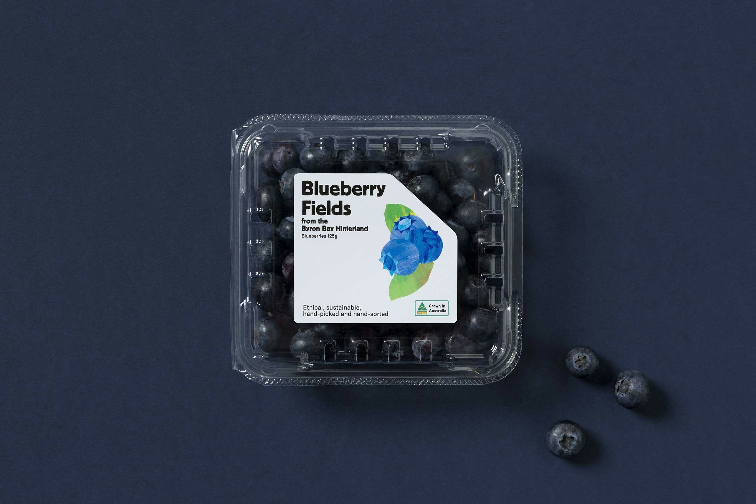
Blueberry Fields
A new identity and label to support their expansion into the major supermarkets


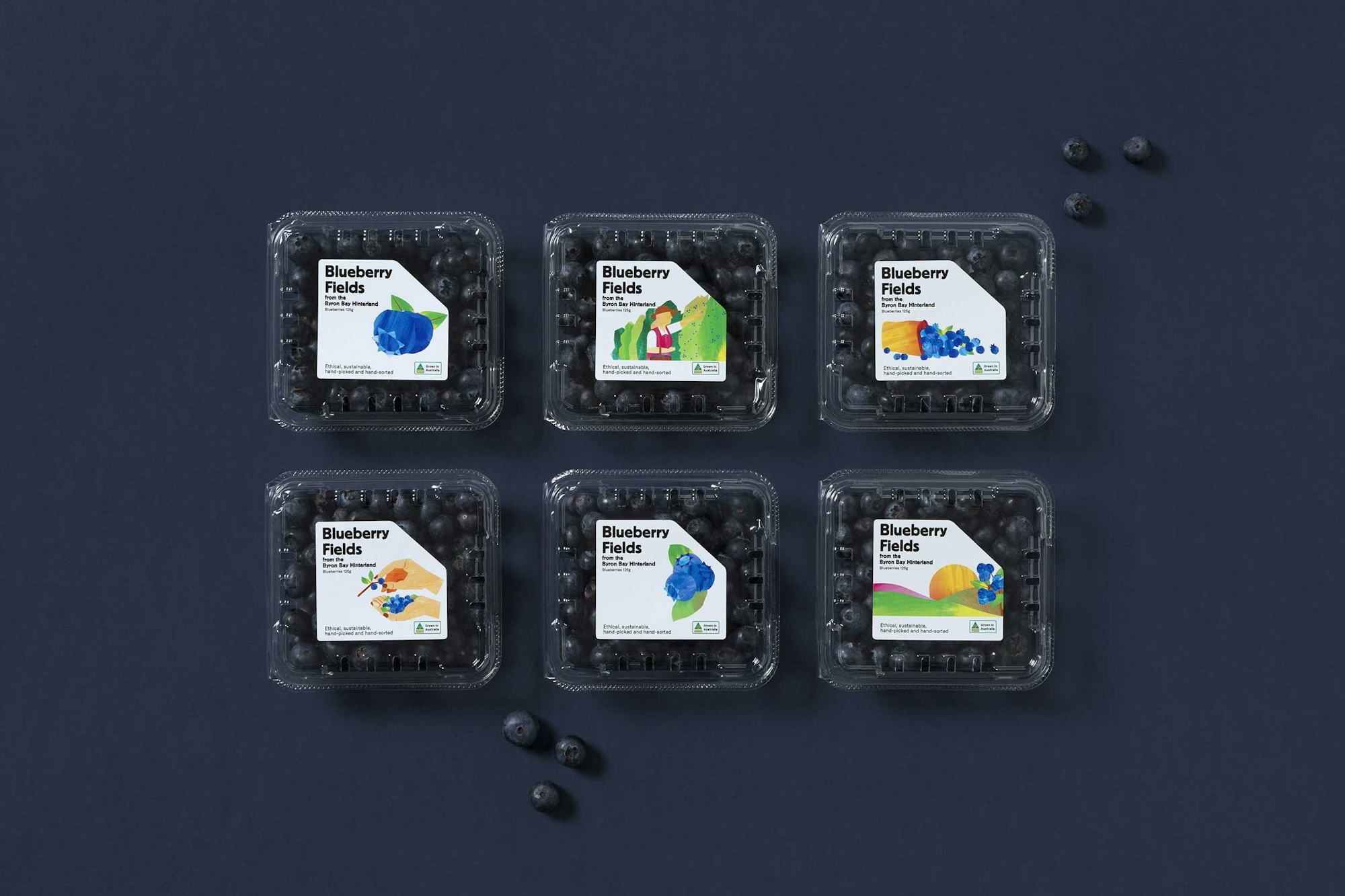
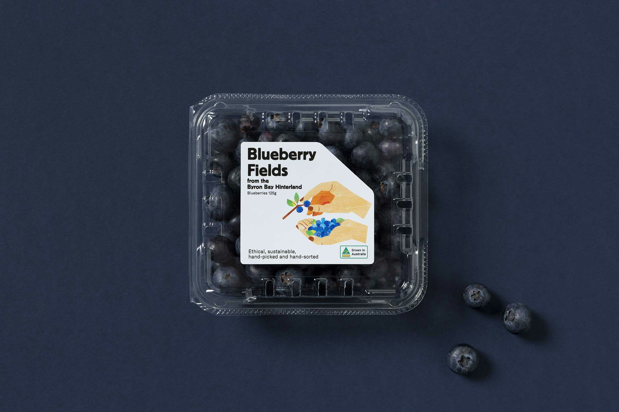
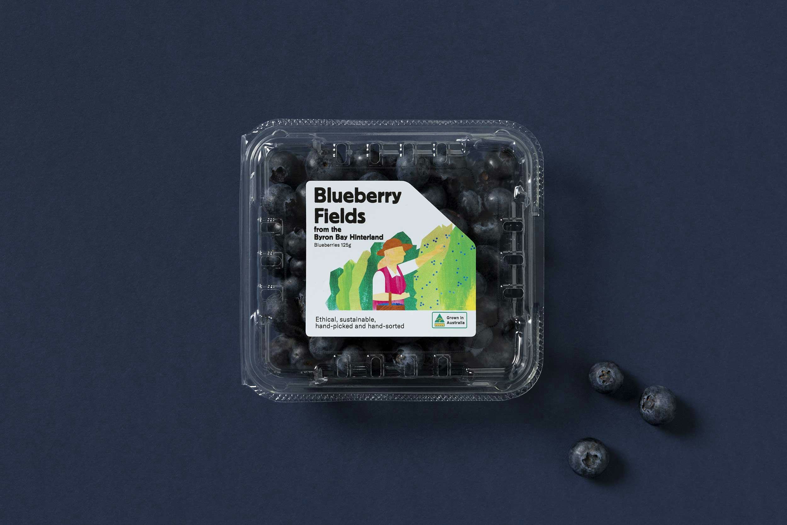
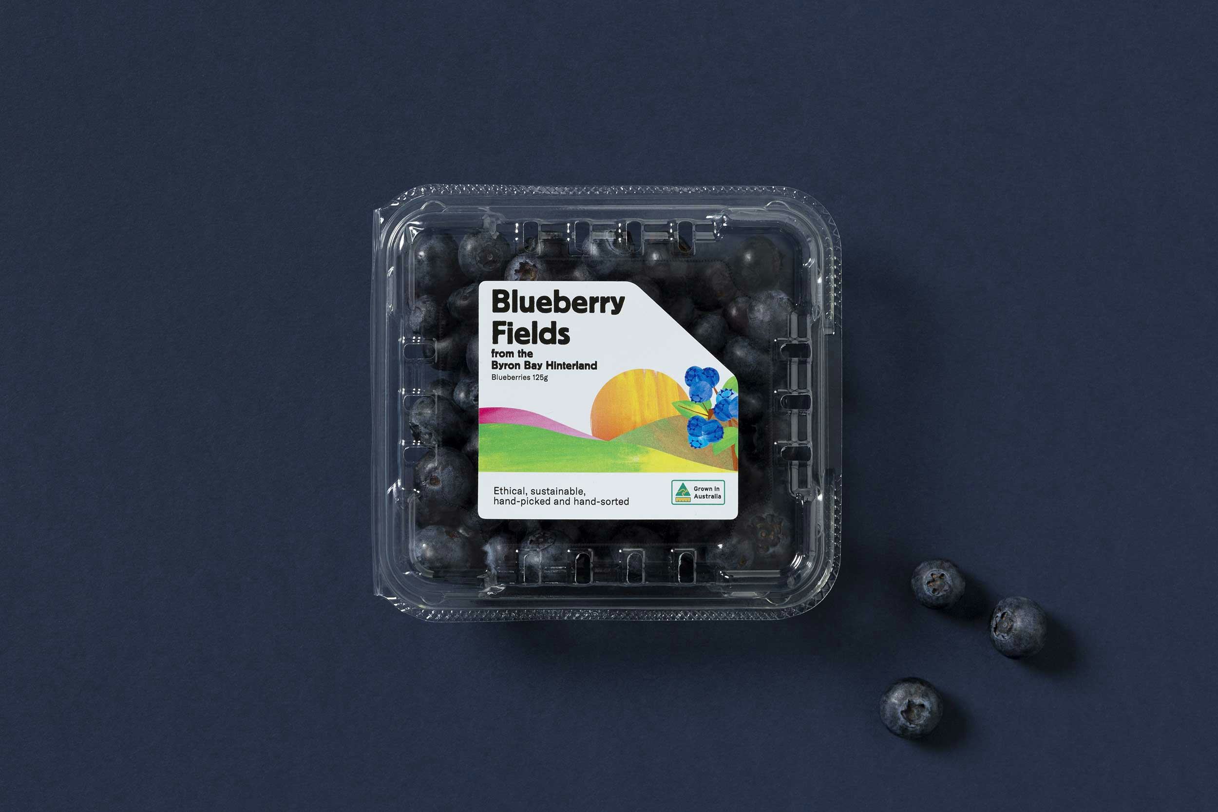
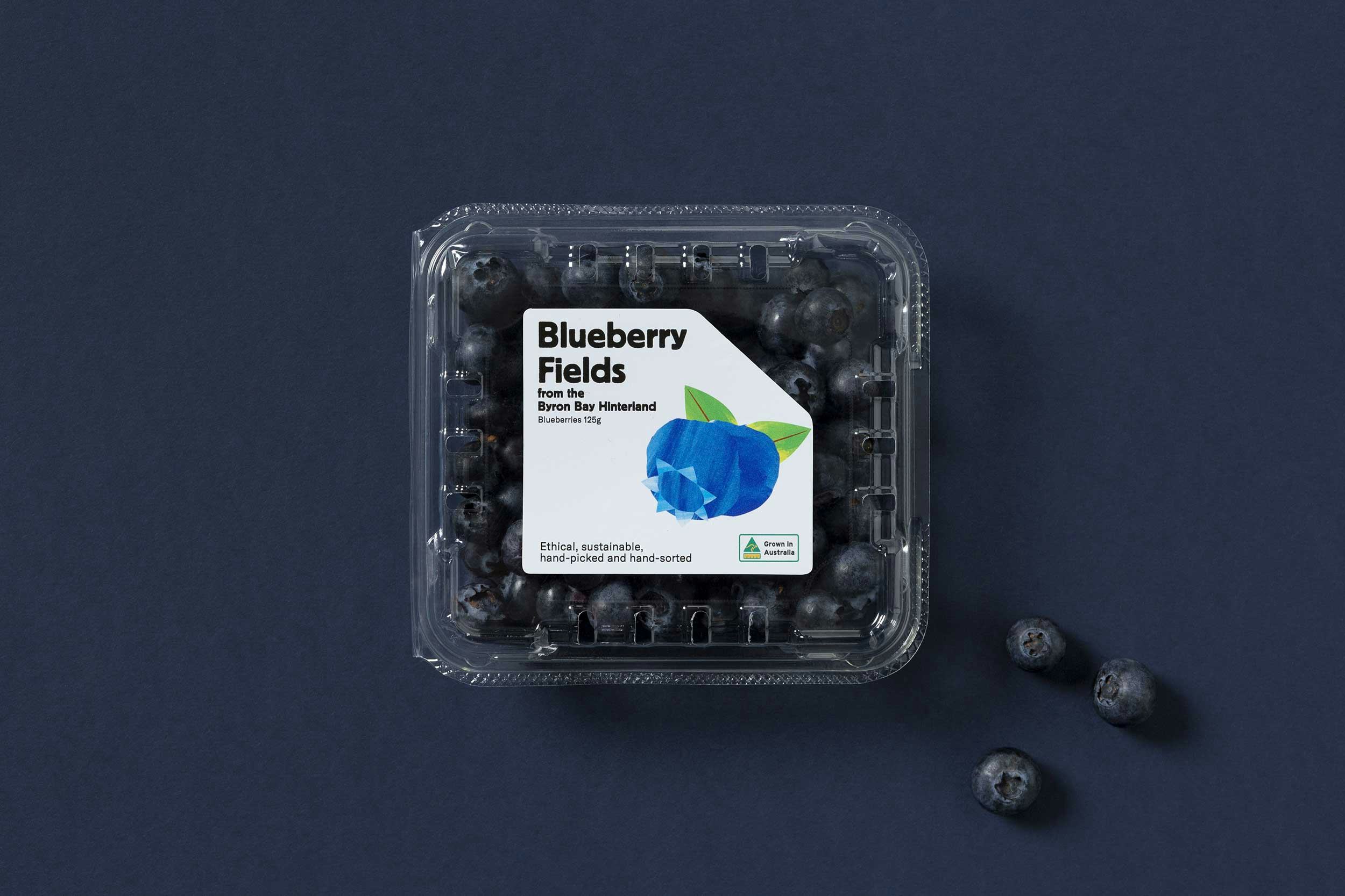
What sets Blueberry Fields aside from the others is their emphasis on the hand grown process. Each berry is picked by hand, checked and then sorted individually by the farmer.
We thought the only way we could do this justice was to replicate their process. We did away with the digital and created a library of handpainted watercolour textures and shapes to tell Blueberry Fields' story.
|
Identity Packaging |
Dialogic Studios |
| Illustration | Dialogic Studios Bryn Desmond-Jones |
| Folio photography | Foliolio |


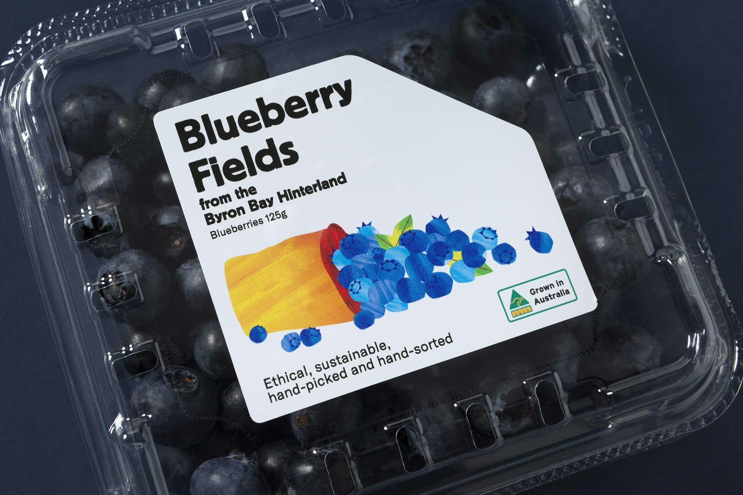

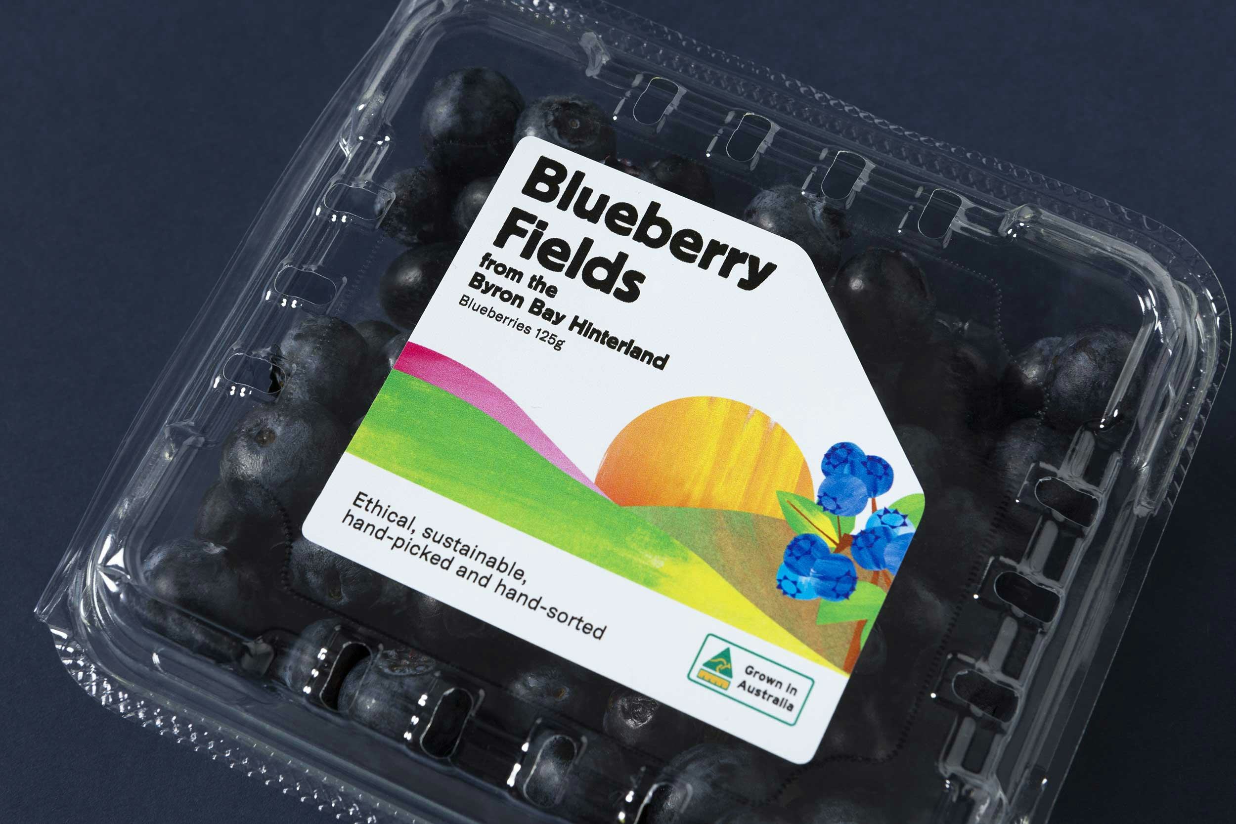
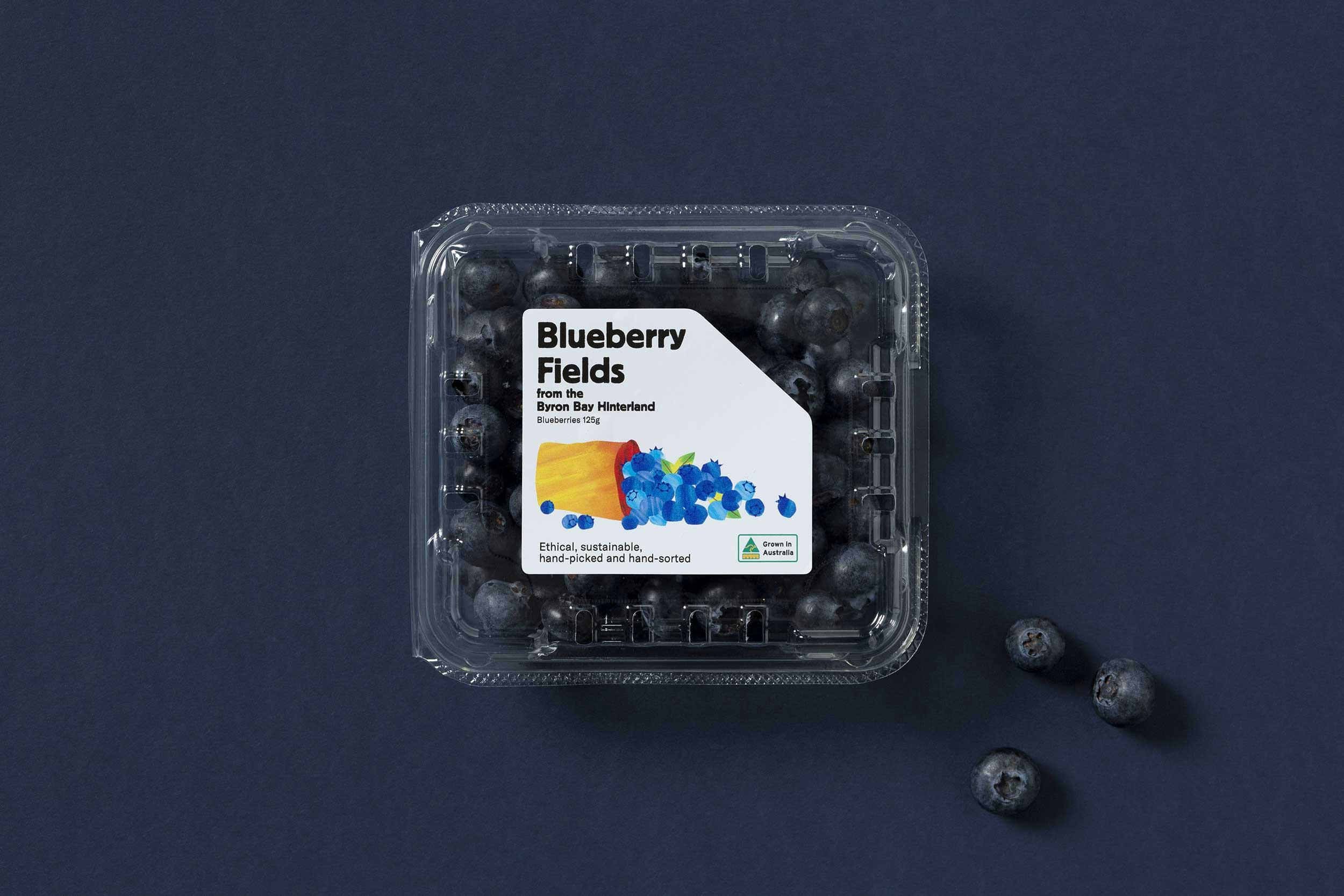
A single label can't tell the whole Blueberry Fields' story so we created a series of six that would sit side-by-side. Together, they give a complete picture of Blueberry Fields ー from its location on the hills of Byron Bay through to the overflowing buckets of berries that eventually make it into our bellies!


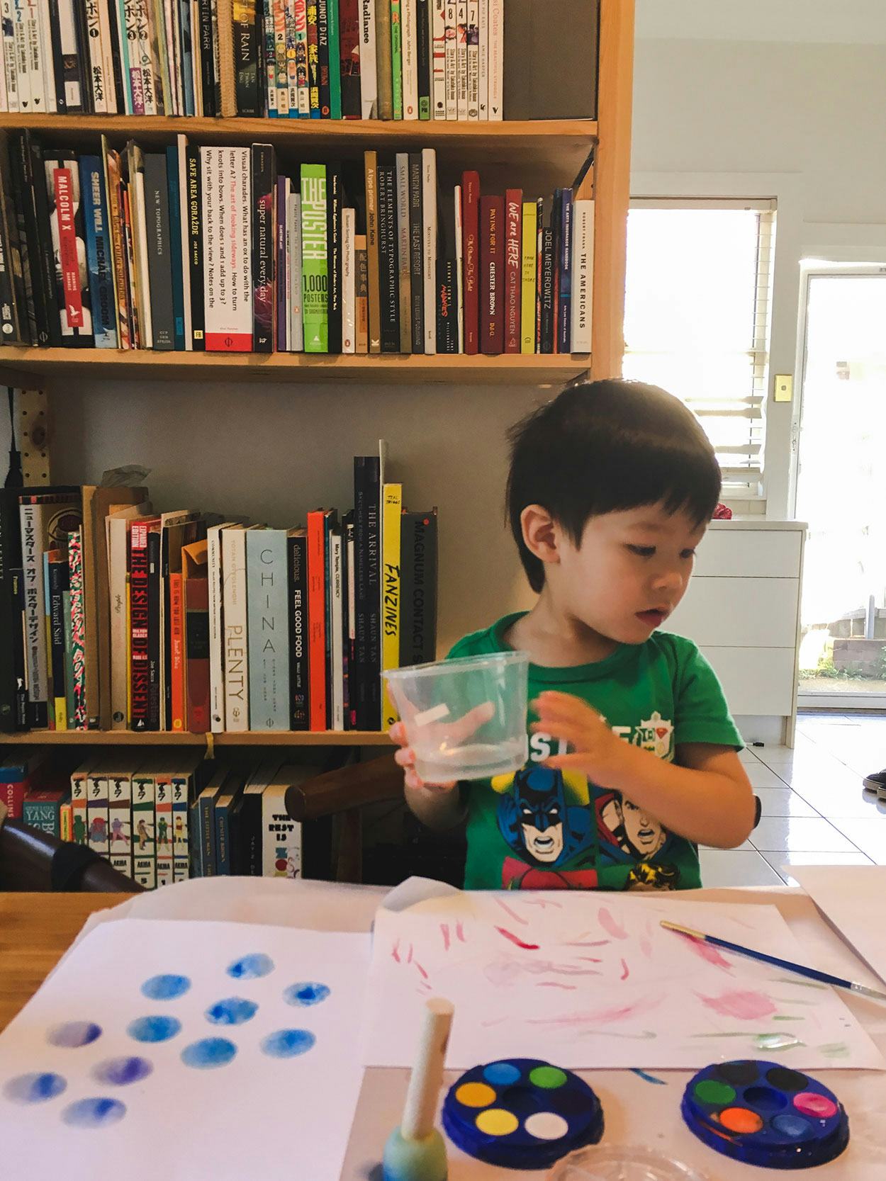
We were lucky that 3-year old Xavier was able to take time out of his busy schedule to accept our commission. His skillful strokes provided the watercolour textures for the illustrations.